
Branding tools
Summer Sports Festival 2026
Logo
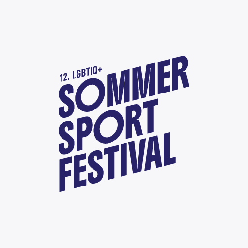
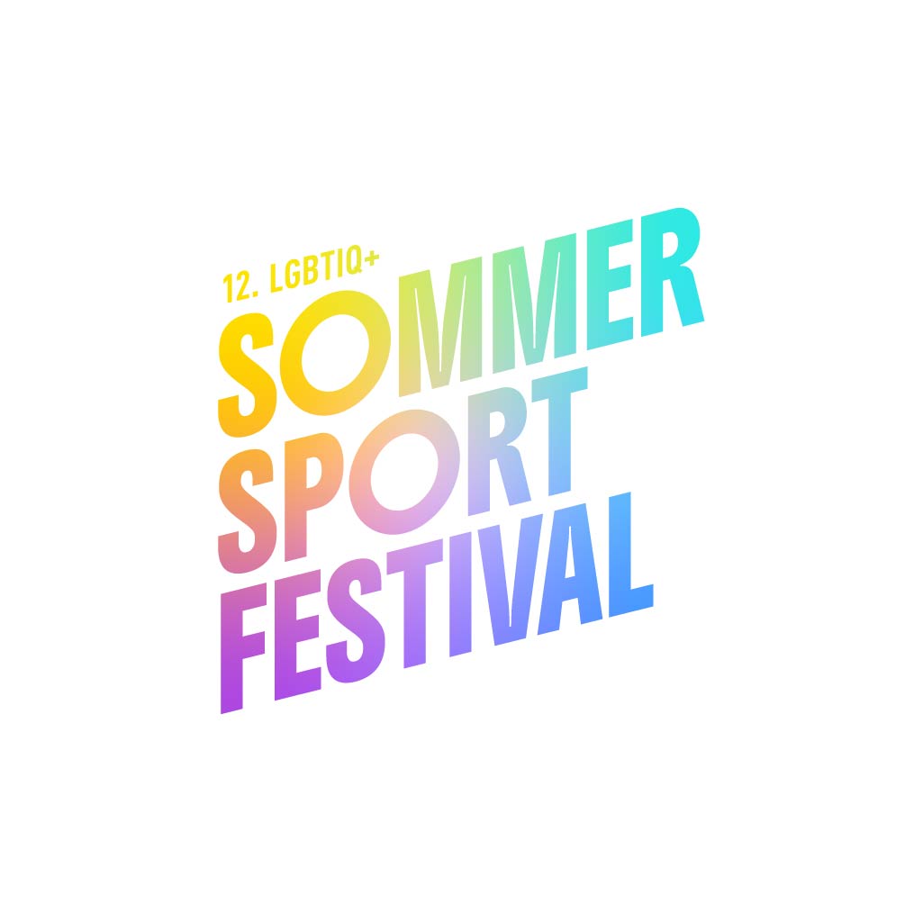
main logo
Our logo is the creative centrepiece around which everything revolves. It is at the heart of our design – and we mean that literally: wherever possible, we place the logo in the centre. It ensures recognition, identity and order in the creative chaos. Please treat it with respect and refrain from creative interpretations, distortions or fashionable gimmicks.
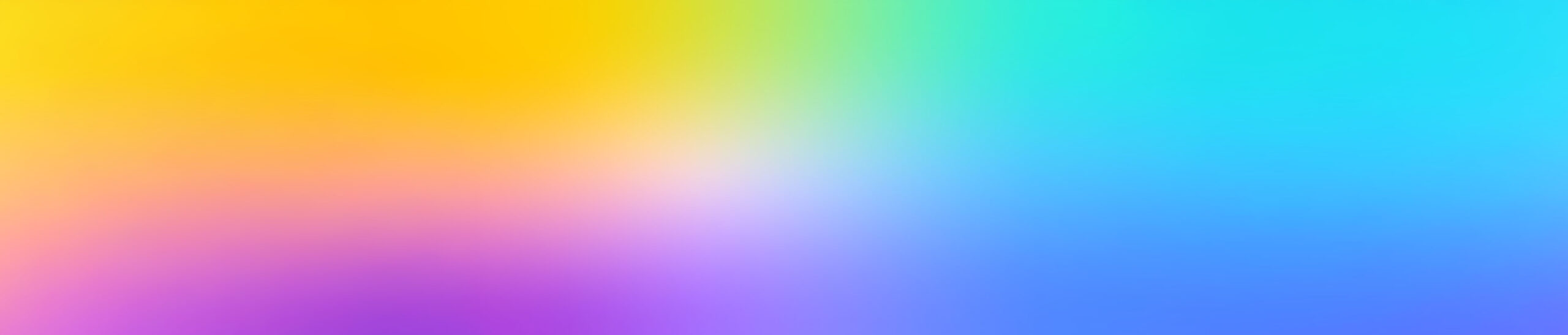
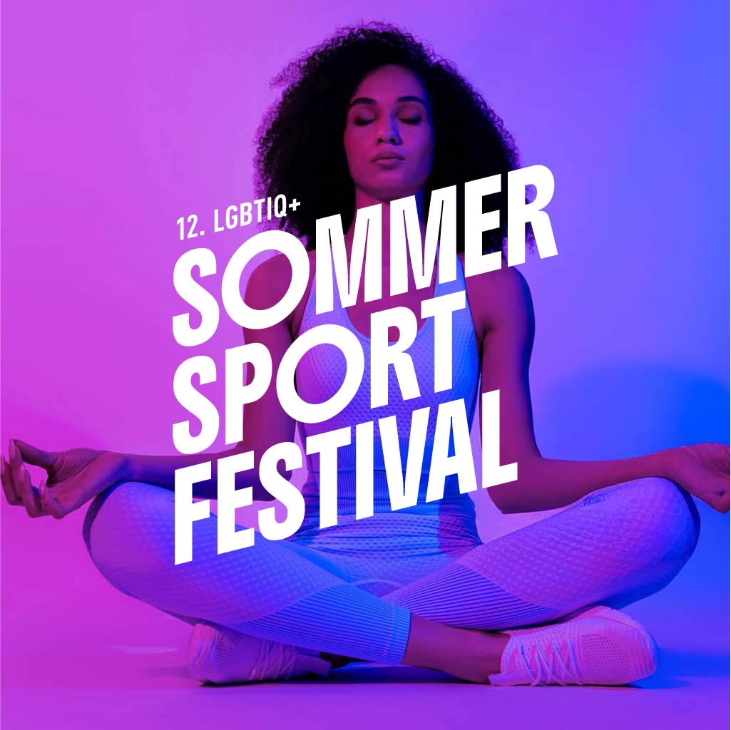
Our logo looks best on our colour gradient. This will be defined later in the guide and not only provides an attractive backdrop, but also the perfect stage for our central design element.

logo colours
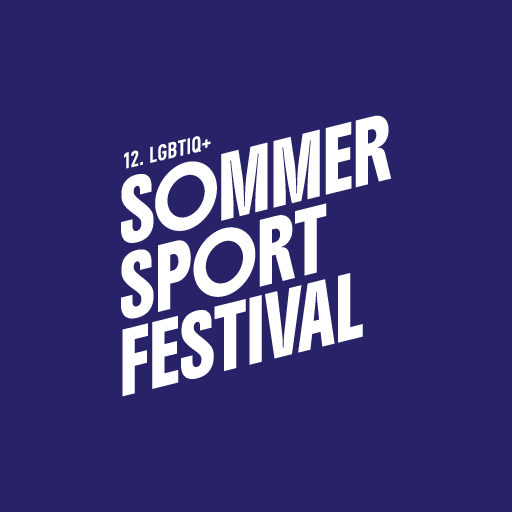
The main logo is and remains white. Where possible, it is displayed on our colour gradient. However, this is not always possible, so there is a defined selection of alternative colour variants.
However, the ones shown are the only possible variants and cover all possible applications. No other combinations are planned, and if you are unsure, it is better to go for the main variant. It always works – and always looks good.
Gößen
Our logo always remains unchanged. However, there is a specially optimised version for very small displays.
This ensures that our logo remains legible even in small formats. To achieve this, the letters have been slightly adjusted – subtly, but effectively.
Furthermore, this version lacks the addition „12. LGBTIQ+”, which should never be omitted. In small sizes, it would be barely legible, which would be a shame. However, in all applications with a larger logo, the addition must always be included.

height larger greater than 60px

height smaller greater than 60px
Logo download
Here you can download all logo files:
Main logo in white
The colour variants blue and rainbow colours
The logo for a height of less than 60px